The best design work is an opportunistic blend of research, collaboration and iteration.
After more than 20 years, I still love getting up every day and tackling user experience challenges: evolving audiences, changing technologies and shifting business needs.
I understand the full lifecycle of design & product development and easily adapt to changing situations while maintaining a strong design process, practice and culture. I'm always happy to get things done and bring humor to all my interactions. I am comfortable managing designers at all expertise levels across timezones and cultures.
Recent Roles & Accomplishments
- Lead product & design for a data-driven e-commerce marketplace. Rebuilt processes and realized sizable growth in traffic and revenues.
- Led three squads overseeing enterprise design system governance that support a large multinational SaaS product org.
- Led work to define a set of design system component services to improve cloud PaaS user experience.
- Built a UX team from scratch, coaching team in research skills and driving data-informed approaches.
Writing
I have tidied up a small space for writing down thoughts about design, leadership, process and how the Design practice is changing and evolving.
Portfolio
I have added a portfolio presentation that covers some of my recent design management and leadership work, as well as some case studies of older projects.
What's Unique About Me?
I have worked as a product manager and developer, which makes me a better collaborator and helps me build the space for Design to do great work.
An interaction designer at heart, I lead with a strong focus on people and relationships, and am always looking to refine Design's impact on the organization while having fun doing it.
Big teams and small, I have worked successfully and had an impact in the largest enterprises and smaller startups. My category expertise ranges from ecommerce marketplaces, communities, and enterprise SaaS, but I believe strongly that great designers can be effective anywhere.
My work has included running design thinking workshops, conducting user interviews, distilling research insights, defining and supporting design processes & workflows, strategy & planning, problem definition, user story mapping, design reviews, performance managment, 1:1s, mentoring & coaching, enablement, development handoff, accessbility, user testing, analytics, a/b testing, NPS, html/css/js, code reviews, and design pairing.
In the end, it's all about enabling designers to be better collaborators while building better experiences.
 Fun Stuff: building keyboards
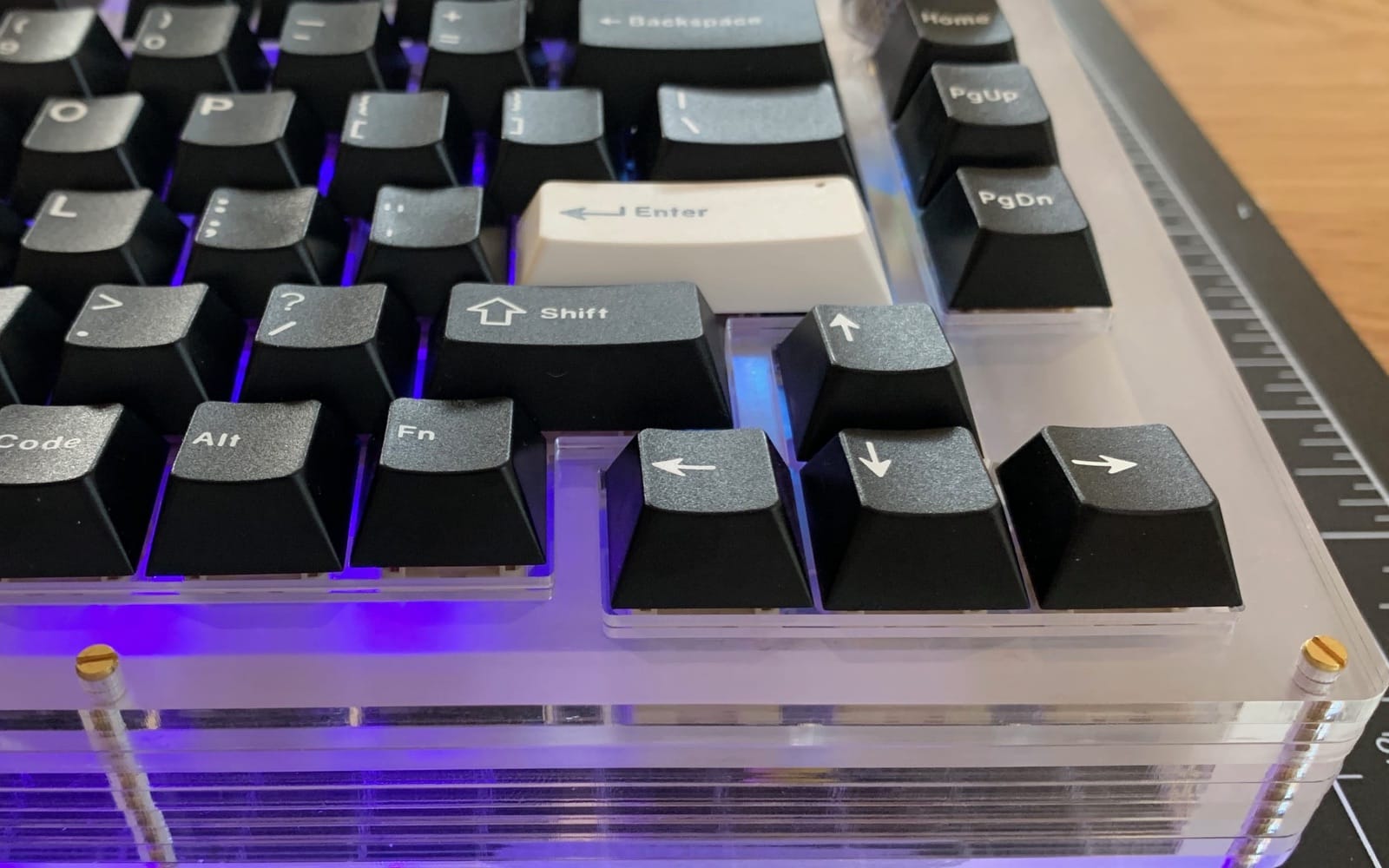
I have been exploring 3D printing and electronics, including building hand-wired keyboards and a macropad.
 Twitter
 Medium
 GitHub
 Linkedin
On Slack @ Designer Hangout, Leading Design, and Rands Leadership
Mantra: Design is a team sport.
This site built with Eleventy, Sass, Google Fonts, some love, sweat, and a fair bit of head scratching.
