
Brand Influence Dashboard
This dashboard provided a “brand vs. brand” comparison of two Twitter accounts, @cocacola and @pepsi. It was built over two days as an experiment, using HTML5, CSS3, JQuery, Codeigniter, and Compass/Sass. It pulled data from the Twitter, Klout and Infochimps APIs.
Roles I built the dashboard myself using HTML/CSS/jQuery/PHP. The design is 100% CSS, outside of logos/avatars.
The Concept
The dashboard is designed to provide an easily digestible, top-level view of Twitter influence dynamics. I chose to format the data using mirrored bar charts, to emphasize the symmetry (or lack) of the data, and then grouped similar data series together into colored categories. Hovering over a data series label will reveal its definition.
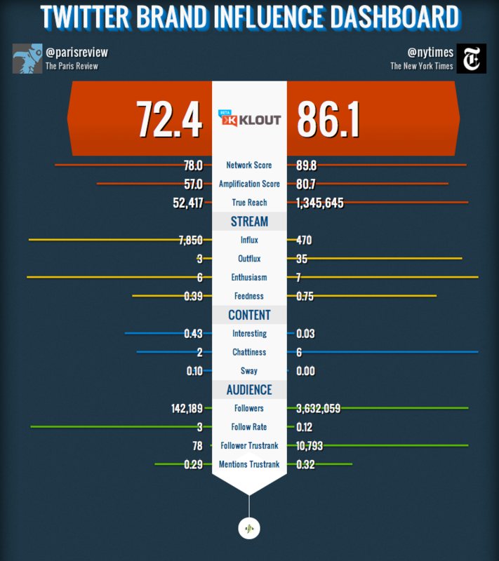
The stream, content, and audience groups are designed to be more actionable metrics, providing a view into how two different Twitter users approach their presence, and how well they are executing it. An obvious next step would be to create group “context profiles” for different situations that would link to collections of advice on strategies or improving performance.
Taking actionable advice to the next level, it would be interesting to integrate a social CRM, for managing individual relationships with your Twitter followers (and Twitter customers). After reading this Twitter-powered customer service story, I was struck by one question: how did they do it? Answering that question for millions of businesses is a huge challenge.