Goldstar iOS & Android Apps
At Goldstar, we support an iOS and an Android app, and actively encourage our members to use the app experience.
App Store links: Goldstar iOS, Goldstar Android
Roles Coordinated user testing, wrote interview scripts, created wireframes and prototypes.
Process
We have been developing with a mobile-first mindset for three years now, since we redesigned our website to be fully responsive. We have spent most of that time working to build parity and consistency among the website and our Android and iOS apps, so that now, when we start working on a new project, we are considering all platforms at the same time. We also now have the opportunity to choose which platform makes sense to start on, which can help speed up development and learning.

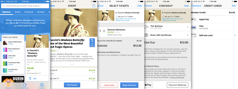
Some of the iOS app purchase funnel screens
The Struggle
Like most companies who operate across the web, iOS and Android, we struggle internally on how best to adhere to the platform's design guidelines, while providing a consistent cross-platform experience.
At Goldstar, we operate in email, search, web, iOS, and Android. All these platforms are interlinked in the customer journey. As we move into the future of digital ticketing, we're pushing more of our members to download the our app, so they can always have their tickets with them. This means that a typical member experience involves email, website and app — so establishing consistency in that experience is paramount.
As we design now, we work to craft an experience that works across all platforms and then address platform-unique factors — either by refining our designs or adopting a platform best-practice. On iOS, we follow the HIG, on Android, we follow the Material Design guidelines. That said, our goal is not to design a Material Design-style app. Our goal is to build the best Goldstar experience or our members.
We have a lot of healthy design discussions about where the line between platform best-practive and our design style is, and sometimes we get it wrong, but that means we're pushing the boundaries, learning and iterating and making the product better. And that's a good thing.

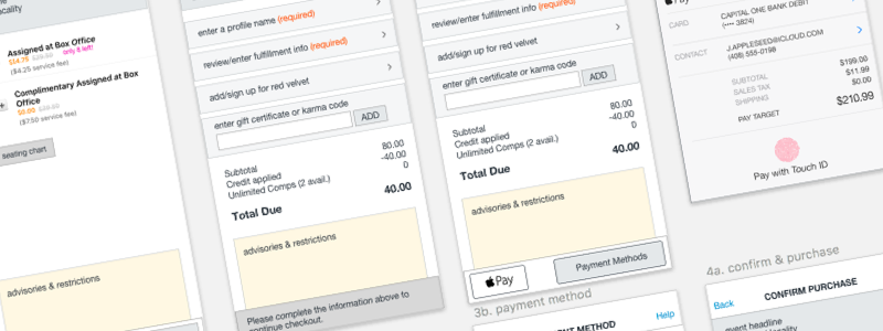
Wireframes for adding Apple Pay support to the iOS app
Apple Pay
We have built a very streamlined checkout process for repeat purchases on Goldstar, and this was reflected in the apps. When Apple Pay came along, we were at a point as a business that we knew we wanted to support it, as well as seeing that our growth trajectory demanded that we start readdressing a lot of our assumptions about how we drive purchases.
So here, we built some light wireframes that modified our checkout flow to support Apple Pay. I built the wireframes working with our iOS developers, and we launched Apple Pay support within 6 weeks of starting the project.
Interestingly, this project, while small and focused, laid the groundwork for the overall checkout redesign we're working on currently, which is much more extensive and affects all platforms.

