Goldstar Checkout Redesign
The team was empowered to solve problems and individual roles fell away.
Roles Led project, managed stakeholders, org-wide communications & development priorities, created wireframes, prototypes, collected analytics.
Outcomes Boosted checkout conversions 15%, decreased errors 70%, increased guest checkout conversions 15%, identified and fixed a six-figure lost-revenue opportunity.
Learned We demonstrated the value of adding instrumentation at the beginning of the project to set benchmarks and guide development.
Redesigning Checkout
I had worked on redesigns of the Goldstar checkout experience several times over the years. These redesigns were typically tactical, focused on tuning the existing experience, while the code was improved.
This time around, we needed to accommodate additional payment methods and improve the guest checkout. But this added complexity would overload the current flow. I convinced leadership that we needed to step back and find a new approach.
Strategy & Approach
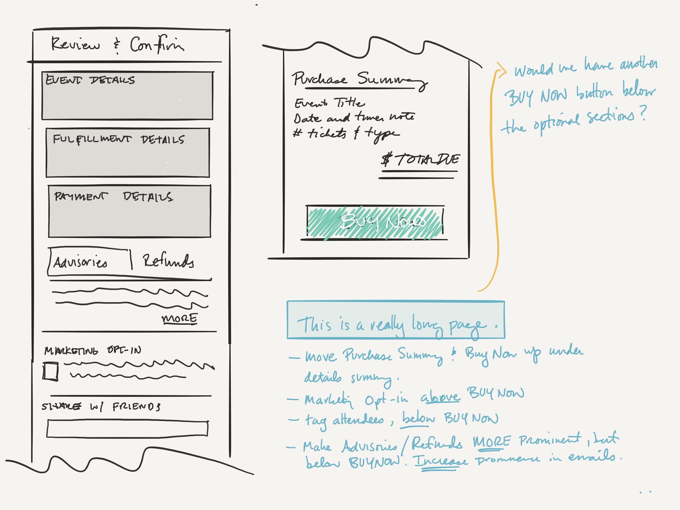
The first step was to collect data about checkout performance. I interviewed users and stakeholders across the company, spending extra time with customer service. I then modeled each checkout step, to understand where information was presented, and identify where we could potentially optimize.
With the team, I focused on uncovering all the requirements we felt we'd need to deliver the project, and prioritized many of those items, since the UX designs weren't finalized. A key component was adding analytics to the app so we could track custom events. This provided an experience baseline we'd rely upon throughout the project.
Iterating On Design Concepts
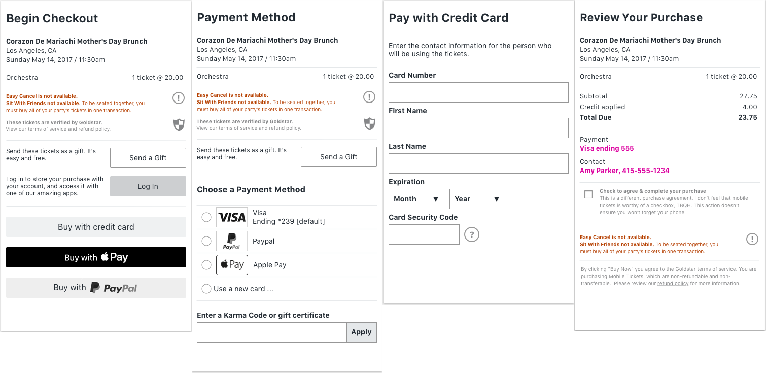
Once the information flow was sketched out, I built several prototypes, exploring several different interaction flows. Engineering shot down many approaches because they'd require too much additional work. The Design team wanted to focus on a flow that emphasized speed, but we also needed to accomodate business requirements. After reviewing feedback, we decided to move forward with a screen-based flow that could be customized and had room to grow.
We iterated fluidly on design concepts, usually with data to back up our decisions, but sometimes we'd circle back to a design that wasn't really working for us. Checkout was primarily about information design, but it had a complex hierarchy with many dynamic components, making it diffcult to identify up-front all the scenarios we needed to design for. I worked to keep the designers and engineers focused on creating a strong foundation that would serve the company over many years. That meant being conservative and sweating every detail.
Defining Delivery
After aligning on initial designs, we sketched out a delivery plan and got the team involved: engineers and a senior product designer. I moved into a managerial role at this point, managing priorities and maintaining strong communications with stakeholders.
My primary focus was communicating with the org and keeping the team focused on delivering value.
I focused on keepng the designer and front-end developer engaged on creative solutions to project priorities that were inclusive of business needs. Often, the team got stuck, so when necessary, I would mediate discussions to find compromises that would move us forward. I relied on metrics to drive a lot of our decision-making: if things were moving in the right direction, we'd invest more, if not, we'd revert the work and move on to the next challenge.
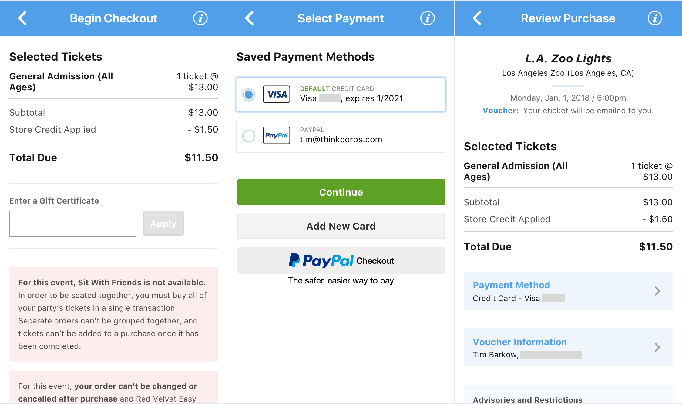
We steadily pushed out small iterations, moving sections from the accordion to screens. Despite this being a very public remodel, the analytics, which I had compiled into a dashboard,kept our confidence high that we weren't tanking conversions.


Unexpected Diversions
PayPal required significant changes to the database, so I focused on removing blockers for the backend devs, while keeping front-end and design busy with A/B tests and experiments around screen transitions. This was unexpected, but I was able to adjust priorities in order to keep everyone busy.
Analytics also discovered a lost revenue opportunity. I socialized our findings with stakeholders to ensure I fully understood the issue. After getting a green light to proceed, we were able to deploy a relatively simple fix that removed an edge case where we were unnecessarily rejecting purchases. This was one of the more satisfying wins, since this issue had been unknowingly degrading conversions for years.

Takeaways
We increased checkout conversions 15%, increased guest checkouts 15%, added PayPal which immediately grew to handle 18% of purchases, decreased form errors 70%, and plugged a $100k+ revenue hole. We also shipped a stretch goal to revise gift purchases. The work was steady, and we were never rushed or under the gun.
In retrospect, I was extremely proud of how well the team functioned. Outside of standups, we huddled daily, always making sure everyone had what they needed and no one was blocked. Roles and titles fell away, and we all focused on getting things done.
Key to the team's empowerment, I believe, was our heavy emphasis on communicating with stakeholders. I held regular 1:1s with key stakeholders, sent out weekly emails to the company, and shared a checkout health dashboard with key metrics. Being in the know gave stakeholders confidence, and that confidence created the space for the team to own the project.
For the team, I tried to keep us focused on objectives, providing high-level guidance, but letting team members make decisions.
I would have liked to have a better handle on the data science in order to make a stronger case for our impact, as well as better visibility into certain A/B tests. Goldstar's inventory is very dynamic, making it difficult to compare conversion rates over different time periods.
