Newsweek
In 2008, Newseek magazine commissioned several teams inside and outside the company, including MagSmith (parent of SMITH magazine), to develop a unique vision for Newsweek magazine.
Roles I led strategy and managed design, including revising InDesign layouts, and also created all web mockups
Larry Smith and I guided a team over a very short 12 weeks to create a 40-page prototype from scratch (including mostly original editorial), with design and layout provided by Portland’s PLAZM, led by Josh Berger. The following is a sampling of some of the ideas contained in our prototype.
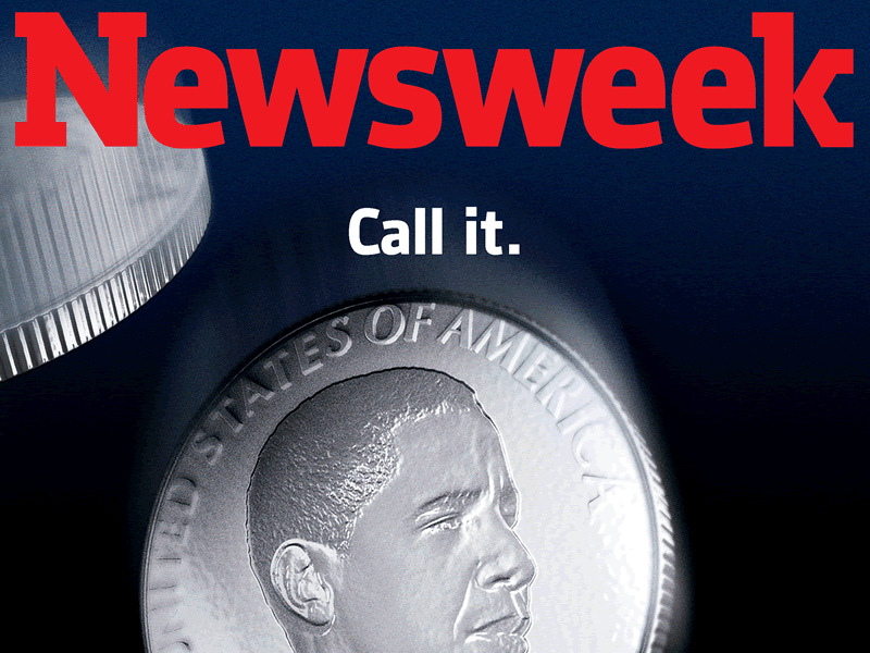
Editorial & Design
Our goal was ambitious: to revision the newsweekly for an Internet-centric future. What we were able to deliver was a rough draft of a print publication that embraced the speed and connectivity of the Web.
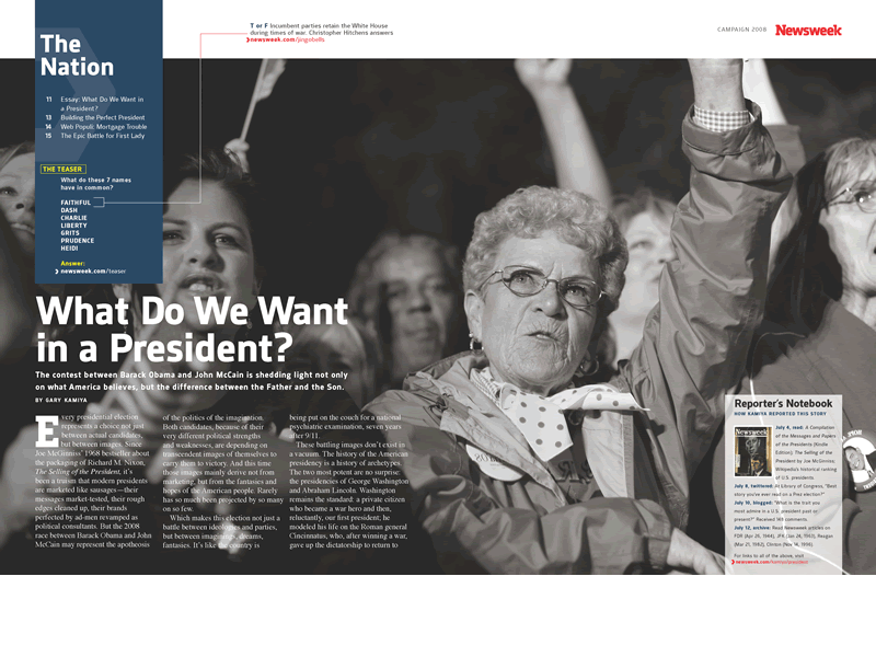
We first restructured the magazine, turning each section into its own mini-magazine, each leading with their own “cover” and table of contents. We felt this would help departments think more graphically. By having all section covers compete for the issue cover, we hoped to raise everyone’s game, and make it easier to expose weak stories.
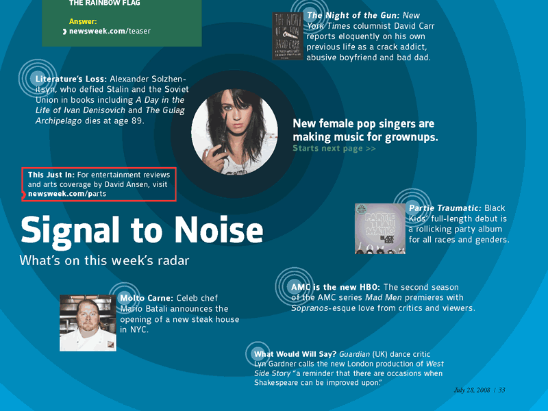
We also introduced small, rapid-fire web call-outs sprinkled throughout the pages, to link print and web in a more serendipitous fashion.
Each feature story, for example, would be accompanied by a reporter’s notebook containing notes and links to web resources, with a full interactive version living online. We wanted to enable “process” journalism, generally favored by online publications, in which the reporter publishes articles as the story develops.
We introduced a signature graphic web callout, using Newsweek’s letter ‘K’ and signature red, to refer to web URLs and content. We also designed an extended call-out that can include icons to indicate the type of content being linked to: slideshows, maps or contests.
Display typography was designed by Plazm to update the Newsweek logo. Interior characters are sans-serif, while the N and K echo the brand’s traditional slab-serif. The resulting presentation is cleaner, modern, and more legible.
Web
Although we were only asked to create print concepts, we felt we needed to include a few web mockups to signify the bridge between the two mediums.
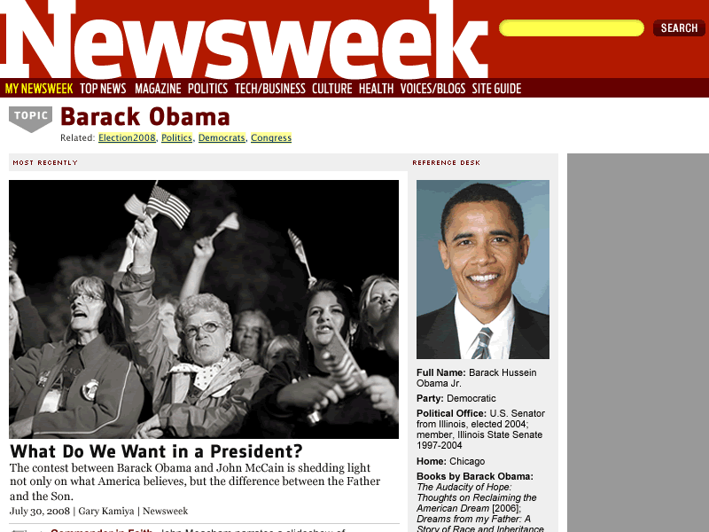
We felt that topic pages, commonly found on media sites, would make linking from print easier and more intuitive than deep links. A topic link (newsweek.com/topic/obama) would link to a page containing recent articles and related information. Readers would find articles from the current issue at the top of the page.
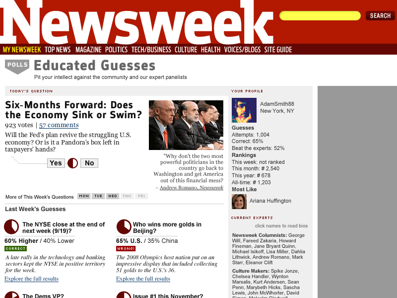
At the time, Newsweek was enamored with polls and popular opinion. We decided it would be fun to up the ante and build an opinion-maker game and community around simple web polls. Each day, members could offer their predictions to a current-events poll. Results would be tallied and community members would accumulate a ranking. Alongside the community, panels of hand-picked experts and celebrities would also vote. For fun, members would be matched with experts they are “most like,” based on voting histories.
These games serve a number of functions. They create a reason to register on the website. They also foster engagement, community and increase pageviews. It’s difficult to underestimate the power these types of interactive features can have in bolstering a community.
Results
Obviously, a publication as large as Newsweek is difficult to steer, especially through treacherous waters. Any newsweekly is facing extremely challenging times, outside of the recession. We were pleased and honored to have been given the opportunity to generate ideas and help the organization out. Newsweek decided to head in a very different direction — uncharted waters, really — but we wished them well in their efforts.

