

Goldstar Likes
User research revealed that a long-standing feature wasn't resonating with our audience. We took the opportunity to reshape the feature to more closely map to current mental models, and were opportunistic about developing a phased rollout strategy.
Roles User experience strategy, prototyping, design & implementation; managed user research, A/B testing, and rollout strategy.
Outcomes 3x increase in likes, 25% more clicks per user, 10x increase in onboarding sessions
Learned How important it is to have a clear understanding of the users' problem and keeping that as your north star to guide design and development.
Quick Summary
- Conducted usability studies to determine where feature was falling down
- Built user story to explain the use case
- Redesigned the feature and crafted a rollout strategy
- Increased engagement which helps drive the purchase funnel
The Story
At Goldstar, we rely on "likes" as an event recommendation signal. As such, it has significant value for the business.
The feature, originally called "Stars", evolved out of two other features — email alerts and bookmarks. We unified those two features into a single tool we could use throughout the site as a signal of member interest in an event. We could also use it to personalize members' experiences and send them alerts when we got new tickets for an event they liked.
Starring was a great success when we rolled it out. But over time, it became clear it hid baggage that was preventing it from reaching its potential.
User research helped us recognize that starring wasn't mapping to users' mental models as expected. We found enough friction in user perception and expectations that we knew we needed to reshape the feature into something more universal.
The Research
We ran a number of usability studies and user interviews to gather feedback. What users told us was crystal clear: while some of them were able to deduce the feature's intent, most just didn't get it.
The lessons we took away: 1) our audiences are always evolving, and a feature designed two years ago might not resonate today, and 2) we almost always carry institutional biases into our design processes.
I think what made this project so interesting/insidious is how small those biases were, but they occured in just the right phase of development to push us off course, and in a way that we wouldn't feel for two years.
The Story
The research was distilled into a user story about our Karen persona wanting to personalize her experience so she wouldn't miss out on great events. Fear of missing out is a very strong, recurring theme with our engaged members.
Fixing a feature like starring raises two questions: what are we going to replace it with, and how are we going to execute the change?
Our first inclination was to add more explanation to support starring, but as we let that idea steep — separate research was revealing the limits of how deeply users were engaged with us — we realized there was only so much we could teach the average member.
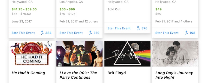
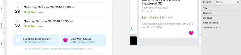
So we decided that we should go all in with the feature users kept mentioning during our interviews and tests: likes, illustrated with a simple heart.
Sketching a rollout strategy
Starring was everywhere on the site, and changing it was going to be a serious undertaking — not to mention one that was never going to be prioritized on the roadmap. We'd have to figure out a way to ninja the changes between other projects.
With one of our senior designers, I planned out a strategy that broke the migration into meaningful, achievable chunks. It was a wholly imperfect strategy, and it took some cajoling on my part, but it was the clearest path to getting the work done.
We attacked onboarding first, since it was effectively isolated from the rest of the site, and adding likes there made a lot of sense as a first step.
While preparing this work, I noticed another bug that was keeping more members out of onboarding. Working with one of our engineers, we identified where the flow was falling down, and we crafted a simple solution that got more new members into onboarding, but also existing members who've never been onboarded.
I tracked onboarding activity through the next few days to make sure it was working, and watched for any customer service feedback. After a few days, we deployed a few small enhancements to the copy and behavior of onboarding, to address some edge cases.
Outcome
As a result of directing more members into onboarding, we saw a 10x increase in onboarding sessions and a 3x increase in likes. In addition, the new, simpler likes generated 25% more clicks per user.
Likes have been rolled out to everyone, and are performing as well as the old starring feature. We're currently planning experiments to hopefully boost engagement further.
It's still early days, but we're extremely happy with the outcome. Our overall engagement is higher with room to grow, and the mental model maps more closely with users' expectations, which should reduce friction going forward.