Goldstar Search & Filtering
As a 13-year-old company, Goldstar had grown from being primarily location-based to a size where search and filtering were sorely needed.
Roles Led a design workshop, created wireframes and prototypes.
Outcomes Increased searches +30%, purchase conversions +3%.
Process
Goldstar had historically categorized events by city, but as the business grew, we needed to add search and filtering to help manage the growing number of events listed in any given locale.
Since this was a big change, both technologically and experience-wise, we hosted a design sprint to explore concepts and build prototypes. As was typical, we invited as diverse a group as possible to participate.
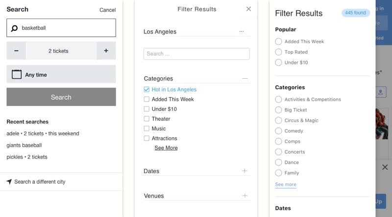
A multifaceted search that presented choices based around the concept of building a night out was the winning concept that the team decided to proceed with. This concept was a step toward search from the more editorial-driven taxonomies the company had used in the past.
We built several prototypes to explore how this concept might work, and user tested their functionality.

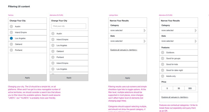
I created wires to explore how mobile filtering could work and reviewed it with the team.
Learning
What we learned, however, by putting the concept into production was that we didn't have enough inventory to justify combining keyword search and filtering into one UI. It was combersome to use in practice, since the fields weren't required, and often led to dead-ends where the search and filters were too restrictive. So while the search, having a more prominent place in the UI, was being used much more than before, it wasn't generating the outcomes we wanted, which was to get more users to an event they wanted to purchase.

We iterated on search, moving from high-concept to a more effective utilitarian approach.
This type of issue is difficult to see outside of the production environment. We couldn't model actual inventory in staging so we never got a good sense of what actual search results would look like. A better solution would have been to implement a basic search, deploy it to production, perhaps behind a feature flag, and iterate based on actual behavior.
This is where a concept like story-mapping can be very useful, because it forces you to think about focusing on that first "walking skeleton" iteration.
Outcomes
While it took a few more iterations to get there, we did finally get to a successful outcome where searches were boosted 30% and purchase conversions increased 3%.
Bonus: In the spirit of leaving things better than you found them, I found time to reorganize the account pages, which had been a bit of a mess and needed an overhaul after we moved more links into the account dropdown to make room for search in the page header. I used a simple hub and spoke IA, ordered based on the popularity/importance of the pages and functionality. This cleanup made the account area much easier to use, and made room for future additions.

